
Printing on Cotton
We’ve worked with many brands over the years printing on both natural and synthetic fibers. We’re going to skip many of the finer technical details and get straight to the main question that weighs on a textile designer's mind…
Printing on Cotton vs Polyester. What’s the difference?
Putting it plain and simple: cotton absorbs more ink than polyester. Polyester fiber tends to be shiny which will enhance print vibrancy and more ink will adhere to the surface of the textile. Cotton has a tendency to mute colors when you print because natural fibers allow more ink to absorb into the textile and less will adhere to the surface. Cotton blends are somewhere in between: some colors might become muted, but not as much as 100% cotton as there is polyester woven into the textile which provides some balance.
Print File Preparation
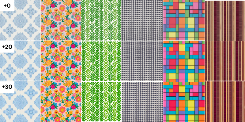
One way to avoid muted color: Take your existing artwork, slightly boost the saturation and vibrancy levels, so that when you print on a natural fiber it will mute itself down slightly, and become closer to what you see on your screen. Looking at the example below we’ve taken one repeat pattern and boosted its saturation and vibrancy by incremental levels and placed them side to side.

Keep in mind that increasing these levels up to +40 is just to demonstrate the process so the differences are clearly visible. The adjustments you make for some of your designs will be minor and will depend on the color palette that you are working with. But there’s only one way to find out…
The Print Test
We highly recommend that you take your designs and run print tests prior to making products available to your customers. What you design on a computer screen may not always translate well onto a printed textile. The only way to know for sure is to print what you see on your screen and then look at the actual print results in your hands.
Use Proper Lighting
When looking at print tests on textiles make sure that you observe the printed results in consistent lighting. The best would be in natural daylight near a window. Printed textiles examined under office lights that are either fluorescent or LED will look different than observed in natural light.
Pro Tip: Multi-Pattern Print Test Images
If you are working on many designs at once, an economical way to run a print test is to create one master image with many designs at varying saturation levels and other adjustments, and line them up in a grid. I would go so far as printing your adjustments or HEX codes directly onto the fabric like a map so it’s always handy as a physical reference.
Focusing on shower curtains? Create a print test shower curtain with several sections of designs intended for that product and see which designs need adjusting and which are fine without changes.
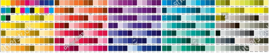
We’ve seen many companies run print tests like the image above with complete color palette maps and HEX codes. If you’re looking for something similar, with ready made charts plus codes, head over to Shutterstock where you can purchase print images just like this one for a couple bucks.
Use the Right Tool for the Job
If your designs and artwork utilize bright, vibrant colors, or photographic type images, then polyester might be the better choice for the product. If you desire to work with natural fiber and blends, then your patterns and designs should utilize color palettes that are less challenging to print.

Pro Tip: Learn from the High End Stores
Try avoiding background colors and use the clean white cotton textile to your advantage! The untouched white space will enhance your patterns and colors, bringing them to life. Take a look at the high end home interior stores to gain useful clues and follow their lead. You’ll see a lot of one, two or three color patterns - Keep it simple
There you have it. We appreciate you taking the time to read this crash course in printing on cotton vs printing on synthetic fiber. If you have further questions feel free to use the Contact Us form and we’ll be glad to give you a hand.